
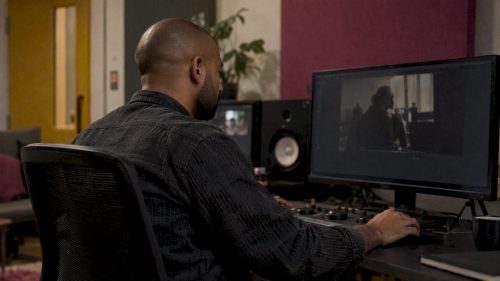
Colour correction fixes problems so your footage looks accurate and consistent. Colour grading comes after and gives it a deliberate look and mood. Correction is the technical step, grading is the creative one, and a polished wedding film, brand video or event highlight reel needs both, in that order.
If you are booking a photographer or videographer, this matters more than it sounds. It decides whether your skin tones look natural, whether clips from two cameras match, and whether the finished piece feels like your brand or your day rather than a default preset.
TL;DR
- Colour correction is the fix: exposure, white balance, contrast and skin tones, so every shot looks natural and matches the next.
- Colour grading is the style: warmer or cooler tones, richer contrast, a mood that suits the story.
- Order matters: correct first, grade second. Grading over uncorrected footage bakes the problems in.
- Grading is not a filter. A preset applies one look to every shot, while a graded edit is adjusted shot by shot.
- Decide the purpose first. The look you want depends on what the footage has to do, whether that is winning clients, telling a story or covering an event.
Table of Contents
- The difference in one minute
- What colour correction does
- What colour grading does
- Why the order matters
- Is colour grading just a filter?
- Does this apply to photos as well?
- What this means for your shoot
- How to brief the look
- Tools, briefly
- Common mistakes
- Booking a shoot with purpose built in
- FAQ
- Sources
The difference in one minute
Think of a portrait you have had retouched. Before anyone thinks about style, the image has to be right: not too dark, not tinted orange by a hall’s lighting, with faces that look like faces. That is correction. Once it is right, you decide how it should feel: bright and airy, warm and golden, moody and cinematic. That is grading.
Creative Bloq puts the sequence plainly: correction comes before grading and fixes technical issues, such as harmonising shots from different cameras, while grading creates a stylistic effect. Its examples of grading include crushing the blacks for a contemporary feel, or lighting a subject’s face so they stand out from the frame.
| Colour correction | Colour grading | |
|---|---|---|
| Purpose | Make footage accurate and consistent | Give footage a look, mood and identity |
| Nature | Technical | Creative |
| Typical tasks | Exposure, white balance, contrast, skin tones, matching cameras | Colour palette, contrast style, highlighting the subject, atmosphere |
| When | First | After correction, near the end of editing |
| Question it answers | Does this look right? | Does this feel right? |
| If skipped | Footage looks off, even if viewers cannot say why | Footage looks clean but generic |
What colour correction does
Correction solves problems that come from the shoot itself: a camera that leaned too blue under tungsten bulbs, a face that is slightly underexposed, a window that burned out the background, two cameras that render the same red differently.
The typical jobs are:
- Exposure: making the image neither too dark nor too bright.
- White balance: setting a neutral baseline so whites look white rather than yellow or blue.
- Contrast and saturation: bringing a flat or oversaturated image back to something the eye accepts.
- Skin tones: making people look healthy and natural, which is the first thing a viewer notices.
- Matching shots: so that every clip in a scene looks as if it belongs with the others.
Videomaker’s guide splits this into two levels. Primary correction deals with the whole frame: white balance, contrast, saturation and the balance of shadows, midtones and highlights. Secondary correction targets one part of the frame, for example putting a soft-edged mask around an actor’s eyes and brightening just that area so they stand out.
The same guide makes a point worth remembering: most viewers could not tell you what colour correction is, or notice when it is missing, but they sense something is off. Good correction is invisible. That is why it is easy to undervalue and costly to skip.
Professionals also do not judge this by eye alone. Videomaker recommends using scopes, which are on-screen readouts of brightness and colour, because they give accurate data regardless of monitor or room lighting. Your laptop screen, tilted or set too bright, is not a reliable judge.
What colour grading does
Grading is the creative pass. Creative Bloq defines it as a post-production process, used in film, video and photography, that alters the colours of an image to create a different look, usually towards the end of editing. It creates consistency across scenes and can set a mood: warmer tones tend to feel lighter and more positive, cooler tones moodier or more foreboding.
In practice grading choices look like this:
- A wedding film with soft, warm skin tones and gentle highlights, so the day feels like it felt.
- A brand video where the product colour matches the logo exactly, so the footage looks like part of the brand.
- A gig film with punchy contrast and deep colour in the stage lighting.
- A corporate piece that stays clean and neutral because credibility matters more than atmosphere.
Grading can be very sophisticated at the top end. For the 2026 film Peaky Blinders: The Immortal Man, the team recorded the digital master onto Kodak 50D negative film, processed it and scanned it back, then finished in DaVinci Resolve. They kept some of the slight colour shifts the process introduced, because embracing them felt more authentic than software emulation they found too perfect. On the series Normal People, the colourist graded in the ACES colour space specifically so the show could later be remastered in HDR.
You do not need that for a wedding or a product launch. The lesson is that grading is a set of decisions about how the footage should feel, not a switch.
Why the order matters
Apple’s Final Cut Pro documentation notes that colour correction is generally one of the last steps in finishing an edited programme. Its reasons include balancing all the shots in a scene, correcting errors in colour balance, exposure and white balance, and making skin tones look right. Creative looks sit on top of that foundation.
The logic is simple. If a shot has a blue cast and you add a warm cinematic look, the two fight each other. The warm look may be too strong in one clip and too weak in the next, and the faces will drift between orange and grey. Fix the base first and every later decision lands the same way across the whole piece.
A typical order for a video edit:
- Assemble and cut the edit so you know which shots survive.
- Correct each shot: exposure, white balance, contrast and skin tones.
- Match shots within each scene, especially from different cameras or lighting.
- Grade for the look: palette, contrast style, attention on the subject.
- Check on a calibrated screen and in the format you will deliver, such as a phone or a projector.
Creative Bloq also recommends doing correction and grading on separate nodes in DaVinci Resolve, so each layer can be adjusted without disturbing the other.
Is colour grading just a filter?
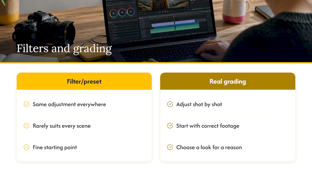
No, though the confusion is understandable. A filter or preset applies the same adjustment to everything. A LUT, short for lookup table, is a preset that maps one set of colour values to another. It is a fine starting point, but every scene is lit differently, so a single preset rarely suits all of them.
What happens when you skip the thinking is easy to spot. The footage looks as though someone found a look they liked and applied it across the board: one clip too dark, the next too saturated, skin tones drifting. Real grading starts with correct footage, then adjusts shot by shot towards a look chosen for a reason.
Shooting style affects this too. Videomaker advises that shooting in log or “flat” profiles gives you a dull, low-contrast image that retains more information for colour work. Creative Bloq adds that if you record RAW or log footage, grading is essential because the image looks flat without it. Footage shot flat is intended to be graded; it is not a finished picture.
Does this apply to photos as well?
Yes. The vocabulary is more common in video, but the same two stages happen with stills. A photographer corrects exposure, white balance and skin tones, then applies a consistent style across the set. The effect of that first step is easy to see in our raw versus edited portrait comparison, which shows a +0.7 exposure adjustment on a single portrait.
For a wedding album, a headshot set or a batch of event photos, consistency is the real goal. Fifty images from a day should look like they belong together, even though the light changed from a dim church to a bright garden.
What this means for your shoot
The reader of this article is almost always about to commission something, so here is how correction and grading play out for each type of client.
Weddings
A wedding moves through very different light: a dim ceremony, bright outdoor portraits, warm reception lighting and dancing under coloured lights. Correction keeps skin tones natural through all of it. Grading then gives the whole story one consistent feel, whether that is light and airy or warm and timeless. Before booking, look at a full gallery rather than a highlight reel, and check that tones stay steady from the ceremony to the evening.
Businesses and brands
For brand content the grade is part of the identity. Product shots and logos need colours that match your brand rather than drift with the lighting on the day. Headshots for a team need to match one another so the “Our people” page looks coherent, even if people were photographed in different rooms or on different days. This is a strong reason to book a team session together, which our Team portrait package is designed around.
If you plan to use the same footage on several platforms, think about format too. Our guide to vertical and horizontal video from one shoot covers how to plan both, and consistent colour across both versions is part of the same job.
Events and conferences
Event lighting is hard: mixed colour temperatures, stage lights, projectors, and rooms that change from wide-open to dark. Correction does the heavy lifting here, because the aim is accurate, usable images with natural faces, quickly. Speed matters too. Event pictures are most valuable while the event is still fresh, which is why we deliver event images within 48 hours. If you need a highlight film, our guide to shipping event highlight videos faster explains how to plan for it.
Musicians
Musicians are the clearest case for heavy grading. Stage lighting is dramatic, and a look can become part of the artist’s identity: gritty, neon, vintage or clean. That look is a creative decision. It still depends on corrected footage, because saturated stage colours, especially reds and blues, can clip and blow out fast. For a sense of a stylised music project, see our music video work for Silvergore.
Interviews and straightforward content
When accuracy is the priority, such as a talking-head interview or a training video, correction alone may be all you need. A natural, clean image is the right look. Save heavy grading for content where mood does the persuading.
How to brief the look
You do not need to know the software. You need to give the person behind the camera a clear target. A short brief covers four things:
- Purpose: what the images or film must achieve, for instance winning enquiries, selling tickets, or remembering a day.
- Reference: two or three examples of a look you like, and one you do not. A mood board makes this quick and gets everyone signed off before the shoot.
- Brand colours: exact colours, logos and any product tones that must stay accurate.
- Where it will appear: website, social, print, screen at an event. The grade should survive the place it will be seen.
Then agree what you will receive and when. With a fixed turnaround and a clear price, there are no surprises when the files arrive.
Tools, briefly
The usual software for both stages includes DaVinci Resolve and Adobe Premiere Pro, which has a Lumetri colour panel, and Final Cut Pro on Mac. They all include colour wheels, curves, LUTs and scopes. Which one is used matters far less than the skill and judgement of the person using it, and whether they work from corrected footage towards a look that was agreed.
Common mistakes
- Grading before correcting. The most frequent error, and it creates uneven results that are hard to untangle.
- One preset for everything. Different scenes need different adjustments.
- Judging on a bright laptop. Screens differ. Check on more than one device and rely on scopes for accuracy.
- Over-grading skin. If faces look orange, green or grey, the grade has gone too far.
- Ignoring the brand. Colours that drift from your logo or product undermine trust.
- Choosing a look with no purpose. A beautiful grade that does not serve the goal is still wasted.
Our view
We start every booking by asking what the pictures are for. That one question settles most of the colour decisions before anyone lifts a camera. A wedding film that should feel warm and personal needs a different treatment from a conference gallery that has to be accurate and quick, and from a founder’s portrait that needs to say “trustworthy” in one glance.
This is why we think about correction and grading as two separate jobs with one aim. Correct images are the baseline: faces that look natural, colours that match, nothing distracting. A look comes after that, and it should be chosen for a reason, not applied because it is fashionable.
Delivery matters just as much as the look. Images that arrive weeks late have lost much of their use, which is why our event work comes back within 48 hours. Our pricing is published, so you know what a session costs before you ask.
Emmet
Booking a shoot with purpose built in
If you want images or film that look right and feel right, we can plan it with you from the start. Our published prices are:
- Portraits: The Solo at £200, The Brand at £500, The Team from £795.
- Weddings: from £1,850.
- London event photography: £400 to £900.
- Corporate events: half-day from £350, day rate from £650 per day, two-day conference from £1,100.
For moving image, see our videography and event videography pages, or start from the LemonLens home page to tell us what you need.
FAQ
What is the difference between colour grading and colour correction?
Correction is the technical step that makes footage accurate and consistent: exposure, white balance, contrast and natural skin tones. Grading is the creative step that gives it a look and mood. Correction always comes first, because a grade built on uncorrected footage will look uneven.
What is colour grading in video?
It is the process of changing the colours of a video to create a particular look, usually near the end of editing. It makes scenes feel consistent and can shape mood, with warmer tones feeling lighter and cooler ones moodier. A grade is adjusted shot by shot rather than applied as one blanket effect.
Is colour grading just a filter?
No. A filter or preset applies one fixed adjustment to everything, while grading responds to each shot’s lighting and content. Presets and LUTs are useful starting points, but they work best when fine-tuned for every scene.
Can I skip correction and go straight to a look?
It is not a good idea. Any exposure or white balance problems stay in the footage and can become more obvious under a strong look. Fixing the base first means the creative choices behave the same way across every clip.
Do photos get graded as well as videos?
Yes. Photographers correct exposure, white balance and skin tones, then apply a consistent style across a set, so a wedding album or headshot series looks like one body of work.
Sources
- What is colour grading? Everything you need to know, Creative Bloq
- What is color correction and why is it important?, Videomaker
- Intro to color correction in Final Cut Pro for Mac, Apple Support
- Inside The Peaky Blinders: The Immortal Man grade, TVBEurope
- Case Study: The Making of Normal People, TVBEurope