Medium-light gray is the safest headshot background you can pick, working across LinkedIn, corporate bios, and press kits regardless of skin tone or lighting setup. Soft blue is the best alternative when you want to read as approachable and trustworthy, while navy or charcoal signals authority for executive and legal portraits. Whatever you choose, preview it at thumbnail size before you commit. Backgrounds that look great full screen can flatten into mush at 100 pixels wide.
TL;DR:
- Medium-light gray remains the most versatile background, flattering most skin tones and maintaining clarity at thumbnail size across platforms.
- Soft blue backgrounds are linked to higher perceived trustworthiness, making them ideal for sales, healthcare, and client-facing headshots.
- Darker neutrals like navy and charcoal are increasingly preferred for executive portraits, providing gravitas without flattening details.
- Background selection should consider industry norms, with finance favoring navy or charcoal, and creative fields opting for muted or textured tones.
- Proper technical setup, including subject-background distance and lighting, is essential to prevent flattening or distracting glare, especially when shooting outdoors or with smartphones.
Table of Contents
- Headshot Background Colors: A Quick Shortlist and What Each One Says
- Matching Background Colors to Your Industry
- Choosing a Background That Flatters Your Skin Tone and Wardrobe
- The Technical Setup: Lighting, Distance, and Depth of Field
- Common Background Mistakes That Ruin a Good Headshot
- How LemonLens Applies This in a Real Session
- Cultural Differences in How People Read Background Colors
- Where Headshot Background Trends Are Heading
- How Lighting Changes the Way a Background Color Reads
- Why Medium Gray Wins More Often Than You’d Think
- Book a Session That Handles the Background Decision for You
- Sources
- FAQ
Headshot Background Colors: A Quick Shortlist and What Each One Says
Pick your background based on the message you need to send, not just what looks nice on your monitor. Here’s how the most common options actually perform once they’re cropped into a small circle on a company directory page.
- Medium-light gray: The default for a reason. It flatters most skin tones, doesn’t compete with wardrobe colors, and holds up whether you’re shooting under daylight or LED panels. Multiple professional photography guides identify mid-tone gray as the most adaptable choice for corporate and LinkedIn headshots, and it’s the background LemonLens defaults to for most portrait sessions.
- Soft blue: This one carries a psychological edge. Analyses of headshot datasets show blue backgrounds correlate with higher perceived trustworthiness, which is exactly why you’ll see it everywhere in sales, healthcare, and client-facing consulting headshots.
- Charcoal or deep navy: These darker neutrals are having a moment in executive portraits. They add gravitas that light gray can’t quite deliver, and unlike pure black, they don’t swallow detail or create a flat cutout look at small sizes.
- Off-white or cream: Clean and modern, especially for tech and startup bios, but it comes with a catch. Pure white can wash out fair skin and read as cold or clinical unless you manage lighting and wardrobe carefully. Off-white with a slight warm cast avoids that trap.
- Muted earth tones and sage: Popular in wellness, coaching, and creative fields where a slightly warmer, human backdrop supports the brand better than corporate gray ever could.
- Black and saturated brights: These are editorial choices, not corporate defaults. A jewel-tone or bold color can work beautifully for a magazine feature or a personal brand page, but it’s risky for a company directory where every other headshot sits on white or gray. Saturated brights also tend to dominate at thumbnail size, pulling focus away from the face.
Matching Background Colors to Your Industry
The right background color depends heavily on what your industry expects to see. A background that reads as fresh and approachable in tech can look unserious in a law firm directory, and a background that reads as authoritative in finance can feel cold in a wellness brand’s team page.
Industry guides consistently map background choice to perceived signals by field, and the pattern holds up across most professional contexts:
| Industry | Recommended background | Why it fits |
|---|---|---|
| Finance and legal | Charcoal, deep navy | Signals authority and gravitas; playful colors undercut credibility |
| Healthcare | White, pale blue | Reads clean and approachable, matching patient expectations |
| Tech and startups | Light gray, soft blue, subtle gradients | Modern without looking stiff or overly formal |
| Creative fields | Editorial black, muted tones | Room for personality without abandoning polish |
| Real estate | Mid-gray, environmental context | Builds trust while keeping the focus on the agent |
If your company or firm has a brand style guide that specifies a background color, that takes priority over any general recommendation here. A consistent look across a team’s headshots matters more than any individual color choice, and firms often standardize on one backdrop precisely so every bio photo matches when displayed side by side.
Choosing a Background That Flatters Your Skin Tone and Wardrobe
Start with a quick check most people skip: look at the veins on the inside of your wrist in natural light. Blue-green veins usually mean a cool undertone, while greenish veins point to warm. This takes ten seconds and changes which backgrounds will flatter you.
The core rule is contrast. Never let your hair color or wardrobe blend into the background. A brunette in a navy suit will disappear into a navy backdrop, and a blonde in a cream sweater will wash out against an off-white wall.
- Cool undertones: Soft blue, medium gray, and charcoal tend to complement cooler skin without adding a sallow or washed-out cast.
- Warm undertones: Muted earth tones, warm gray, and cream backgrounds pull out warmth in the skin rather than fighting it.
- Deeper skin tones: Medium-light gray and soft blue both provide enough contrast for clear separation, while pure white can sometimes flatten detail if lighting isn’t adjusted carefully.
- Fair skin tones: Avoid pure white without a rim light. Off-white, sage, or medium gray give more forgiving results.
If you wear glasses, background choice interacts with glare more than people expect. Glare on glasses in photos usually comes from a light source reflecting straight back at the lens, and a busy or high-contrast background makes that reflection more distracting once it’s visible in the frame. A slightly angled head position, paired with lights positioned above and to the side rather than straight on, cuts most reflections without needing special lenses.
Pro Tip: If you’re shooting outdoors or against a window, tilt your chin down by about ten degrees and angle your glasses slightly. That small adjustment kills most window and sky reflections without changing your expression.

The Technical Setup: Lighting, Distance, and Depth of Field
Getting a background color right on paper means nothing if the technical execution flattens it into a distracting mess. A handful of adjustments make the difference between a background that supports the shot and one that fights it.
- Put distance between you and the background. Studio photography guidance emphasizes that subject-to-background distance is essential for softening texture and avoiding harsh shadows cast directly behind you. Six to eight feet of separation is a reasonable starting point for most home or studio setups.
- Use a portrait focal length. A lens in the 70 to 105mm equivalent range compresses the background nicely and avoids the distortion wider lenses introduce at close range.
- Choose an aperture that separates you from the backdrop without losing detail. f/2.8 to f/5.6 is a common working range, depending on your sensor size and how far back you’re standing. Wide enough to blur the background, narrow enough to keep both eyes sharp.
- Add separation with edge or hair light. A rim light behind the subject prevents dark hair from merging into a charcoal or navy background, and prevents fair hair from disappearing into cream or off-white.
- If you’re using a smartphone, portrait mode can approximate this look, but check the edges of your hair and shoulders for the telltale blur artifacts that give away artificial background separation. Move closer to a plain wall and farther from clutter if the software struggles.
Readability at a glance matters more than most people realize once a photo shrinks down. A LinkedIn thumbnail displays at a fraction of its full size, and a background with too little contrast against hair or clothing collapses into a blur that no longer reads as intentional. Test every final shortlist photo at the smallest size it’ll actually appear before you pick a favorite.
Common Background Mistakes That Ruin a Good Headshot
Most bad headshots aren’t bad because of bone structure or expression. They’re bad because of a background decision made without thinking through the downstream effect.
- Pure white with no rim light on pale skin. Without separation, the subject’s outline gets soft and the whole image reads flat. Switch to off-white or add a thin edge light to fix it.
- Dark clothing against a dark background with no separation. A charcoal suit against a charcoal backdrop erases the subject’s shape. A hair light or a slightly lighter background solves this instantly.
- Busy environmental backdrops that pull focus from the face. Bookshelves, windows, and office clutter behind a subject compete for attention. Simplify the space or shoot with a wider aperture to blur it into soft shapes.
- Choosing a color because you like it, not because it fits the platform. A background you love on your living room wall might clash badly with what your industry or company directory expects.
- Skipping the thumbnail check. Always preview the final selects at the small circular crop LinkedIn and most directories use before locking in a choice.
How LemonLens Applies This in a Real Session
A good session starts before the camera comes out. On arrival, a photographer should confirm the brief (LinkedIn profile, website team page, press kit), check which platform the images are headed for, and look over wardrobe choices against the planned backdrop.
From there, shooting a neutral default alongside a brand-aligned or creative variant in the same session avoids the need for a reshoot later. A typical LemonLens portrait session captures a clean neutral shot for formal use, a second option that reflects personal or brand style, and sometimes a third environmental frame if the setting adds context worth keeping. Sessions often include a quick turnaround so clients receive images sized appropriately for LinkedIn, website bios, or press pages without need for additional editing.
If you’re prepping for a session yourself, run through this before the shoot:
- Confirm which platforms the photos need to serve.
- Bring two wardrobe options that contrast with your planned background.
- Check your skin undertone and pick a background family that complements it.
- Ask whether a second variant (brand color or environmental setting) makes sense for your use case.
Cultural Differences in How People Read Background Colors
Color perception isn’t universal, and a background that reads as neutral in one market can carry unintended weight in another. Red signals luck and celebration in many East Asian business contexts, while the same color can read as alarm or aggression in Western corporate settings. White, often treated as clean and modern across much of Europe and North America, carries associations with mourning in parts of East Asia.
For most professional headshots aimed at LinkedIn or an international audience, this is exactly why neutral tones like gray, soft blue, and muted earth colors dominate the recommendations you’ll see from photographers worldwide. They carry the fewest conflicting cultural associations while still communicating competence and approachability.
If you’re building a headshot specifically for a regional market, it’s worth a quick gut check on local norms before locking in a saturated or symbolic color. A finance executive photographed for a directory serving multiple countries is almost always better served by a background that reads as neutral everywhere rather than one optimized for a single cultural context. When in doubt, the safest move is sticking with tones that carry minimal symbolic weight: greens, grays, and blues rarely trigger strong associations in either direction, which is part of why they’ve become the default across so many industries and regions.
Where Headshot Background Trends Are Heading
The flat gray studio backdrop that dominated corporate headshots for a decade is losing ground to a wider mix of options. Darker neutrals like charcoal and deep navy are increasingly replacing light gray in executive portraits, driven partly by a desire for more visual weight on senior leadership pages and speaker bios.
At the same time, colored and textured backgrounds are becoming more common outside strictly formal corporate contexts. Muted sage, warm terracotta, and soft gradient backdrops are showing up more in coaching, wellness, and creative-industry headshots, reflecting a broader shift toward personal branding that still reads as professional. The rigid one-size-fits-all corporate headshot is giving way to a more segmented approach: one look for the company directory, a warmer or more distinctive look for a personal website or speaker page.
Environmental and on-location headshots are also gaining ground, particularly in real estate, hospitality, and creative fields where a contextual backdrop, an office, a storefront, a workspace, builds credibility that a plain studio backdrop can’t. That said, the fundamentals haven’t shifted. Whatever the current style trend, contrast, lighting, and thumbnail legibility still decide whether a background actually works.
How Lighting Changes the Way a Background Color Reads
The same backdrop can look completely different depending on what’s lighting it, and this trips up more DIY headshot attempts than color choice itself. A gray backdrop under warm tungsten light picks up a yellow or amber cast, while the same backdrop under daylight-balanced LED panels reads neutral and clean. Mixing light sources, a window plus an overhead fluorescent, for instance, often introduces a color cast that’s hard to correct without editing.
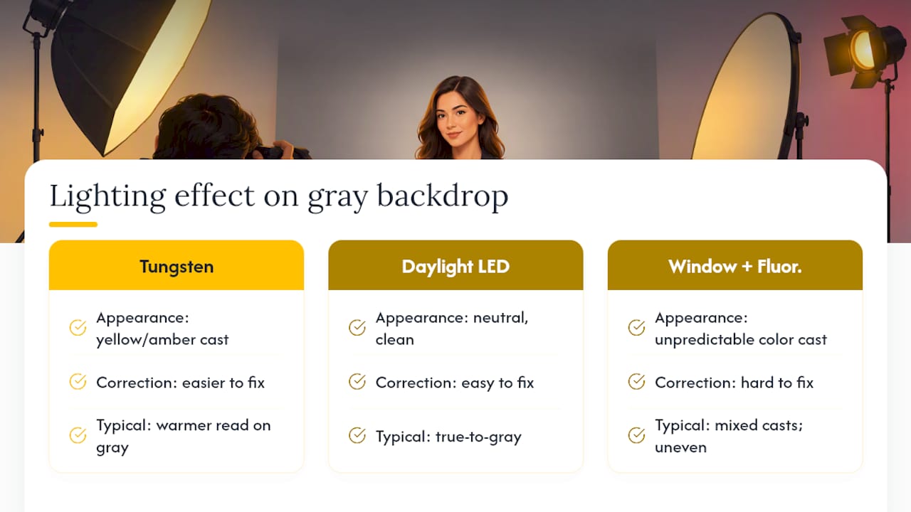
Natural light shifts throughout the day, which matters if you’re shooting outdoor headshots. Outdoor headshots in London, in particular, deal with famously inconsistent light: an overcast sky acts like a giant softbox and renders backgrounds fairly true to color, but direct midday sun creates harsh shadows and can blow out lighter backgrounds entirely. Early morning or late afternoon light tends to add warmth that flatters most backdrop colors without overpowering them.
If you’re shooting indoors, position your key light so it hits the subject’s face without spilling unevenly across the background, since uneven lighting can make one side of a solid backdrop look a full shade different from the other. A separate light aimed at the background, distinct from your main subject light, gives you control over exactly how that color renders in the final frame rather than leaving it to whatever ambient light happens to hit the wall.
Why Medium Gray Wins More Often Than You’d Think
Medium gray isn’t the exciting choice, and it’s not going to make a headshot go viral. But after enough sessions, you start to notice a pattern: it’s the background that causes the fewest problems across skin tones, wardrobe choices, and lighting setups that aren’t perfectly controlled.
The field tip that saves the most time in a short session is simple. Shoot the neutral background first, get it locked, then experiment with a second variant if time allows. Clients almost always end up using the safe shot for their most visible profile anyway. Before you send over final selections, pull up each one at actual LinkedIn thumbnail size. A shot that looks polished at full resolution can lose all its contrast once it shrinks down to a hundred pixels wide.
— Emmet
Book a Session That Handles the Background Decision for You
Reading through every contrast rule and lighting setup above is one option. Booking a session with an experienced photographer can handle background decisions by focusing on the intended use of the images and adjusting backgrounds and lighting accordingly before shooting.
That means arriving without needing to know your undertone or worry about aperture settings. The Portraits lineup covers what most people need: The Solo at £200 for an individual headshot session, The Brand at £500 for a package built around personal or company branding, and The Team starting from £795 for groups that need consistent backgrounds across every headshot. Every session wraps with rapid turnaround, so your images are ready while they’re still relevant, not weeks after you needed them. If your team needs on-site sessions with a standardized backdrop, check availability for a team session and get a quote based on your group size.
Sources
- Headshot Background Guide: What Works by Industry | InstaHeadshots
- Kahma
- What Is a Clean Background Headshot for Professionals | Eric Campbell Photography
FAQ
What color background is best for headshots?
Medium-light gray is the best all-around choice because it flatters most skin tones and holds up across platforms like LinkedIn, company directories, and press kits. Photography guides consistently identify it as the most versatile option, though soft blue works well when you want to emphasize approachability and trust.
What colors should I avoid for headshots?
Avoid pure white without proper rim lighting, since it can wash out fair skin and read as cold rather than approachable. Saturated brights, busy patterns, and pure black are also risky because they either distract from the face or lose detail at small thumbnail sizes.
What are some good backgrounds for headshots?
Beyond medium-light gray, soft blue, charcoal, and navy all perform well depending on your industry and the impression you want to make. Off-white, muted earth tones, and sage work nicely for creative or wellness fields where a warmer, more personal look fits better than corporate gray.
What should I avoid in a headshot background?
Avoid letting your hair or wardrobe blend into the backdrop, since low contrast erases your outline and flattens the shot. Also avoid busy or cluttered environments that pull attention from your face, and always check how your final image looks at a small thumbnail size before finalizing your selection.
Does LemonLens test different backgrounds during a session?
Yes. LemonLens sessions typically capture a neutral default alongside a brand-aligned or creative variant, so you leave with options suited to different platforms without needing a second shoot. Pricing starts at £200 for The Solo individual session.